
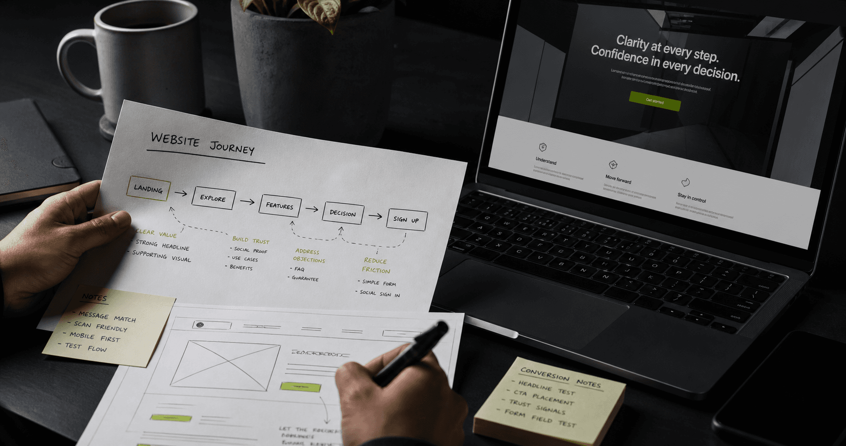
A website converts when it helps the right visitor understand the offer, believe it is relevant, and take a sensible next step. That outcome depends on the whole journey. A brighter button cannot rescue an unclear proposition, a slow mobile page, or a form that asks for too much.
Conversion also needs a useful definition. A software company may need qualified demo requests. A professional service may value detailed enquiries. An ecommerce business needs purchases, but can also learn from product discovery and checkout progress. The target action should reflect how the business creates value.
The core problem: attention without direction
Many pages are assembled around what an organization wants to say rather than what the visitor needs to decide. Internal terminology becomes the headline, navigation mirrors departments, and every stakeholder adds another action. The page grows, but the decision becomes harder.
Traffic source matters too. Someone arriving from a specific service search has different context from a person following a recommendation. If both land on a generic page with no clear path, the site wastes the intent that brought them there.
Match the page to visitor intent
Intent is the practical reason behind a visit. The page should acknowledge that reason quickly, then provide the information needed for the next decision. A visitor comparing suppliers may need process, fit, evidence and commercial context. Someone researching a problem may need a clear explanation before contacting anyone.
This is where information architecture and thoughtful website planning meet. Important services deserve clear destinations. Supporting pages should answer adjacent questions and create natural routes between discovery, evaluation and action.
Make the value proposition specific
A useful proposition says what the business helps with, who it helps, and why the approach is relevant. It does not need to compress every capability into a slogan. It needs to give the visitor enough clarity to keep reading.
Specific language is more useful than broad claims such as innovative or leading because it reduces interpretation. Headings should carry the argument. A reader scanning only the headings should still understand the offer, approach and next step.
Build hierarchy and mobile UX around decisions
Visual hierarchy tells people what matters first. The primary message, explanation, proof and action should not compete at the same volume. Navigation should use familiar labels and keep valuable routes easy to reach. On mobile, this often means stronger editing, not simply stacking the desktop layout.
Touch targets need room. Headings must wrap comfortably. Sticky elements should not cover content. Forms need suitable input types and clear errors. A focused user experience design process resolves these details around actual tasks rather than decorative preference.
Reduce technical and psychological friction
Speed shapes the experience before the message can work. Oversized images, unnecessary scripts, unstable layouts and delayed interaction can make a credible business feel unreliable. Performance should be considered during design and development, then checked on realistic devices and connections.
Trust is equally practical. Clear contact information, an honest process, relevant work, transparent expectations and well-written policies reduce uncertainty. Decorative badges and unsupported claims cannot replace evidence related to the decision.
Treat forms and calls to action as commitments
A call to action should describe a next step the visitor can understand. Its commitment should match the page. Someone reading an introductory article may want to explore relevant work. A qualified buyer on a service page may be ready to discuss a project.
Forms should collect only what is useful at that stage. Required fields, privacy expectations, error messages and confirmation states affect completion. Asking for detailed information or account creation before demonstrating value can stop interested people.
Measure and improve the whole journey
Measurement should follow the real path to value. Alongside final enquiries or purchases, teams can examine meaningful steps such as form starts, validation failures, product views and checkout progression. These signals locate friction without pretending every interaction matters equally.
Common mistakes include sending every campaign to the homepage, hiding the offer behind clever language, and optimizing for form volume while ignoring enquiry quality. The strongest next decision is usually to identify the most valuable audience and review its entire path from entry point to follow-up.